

Project Overview
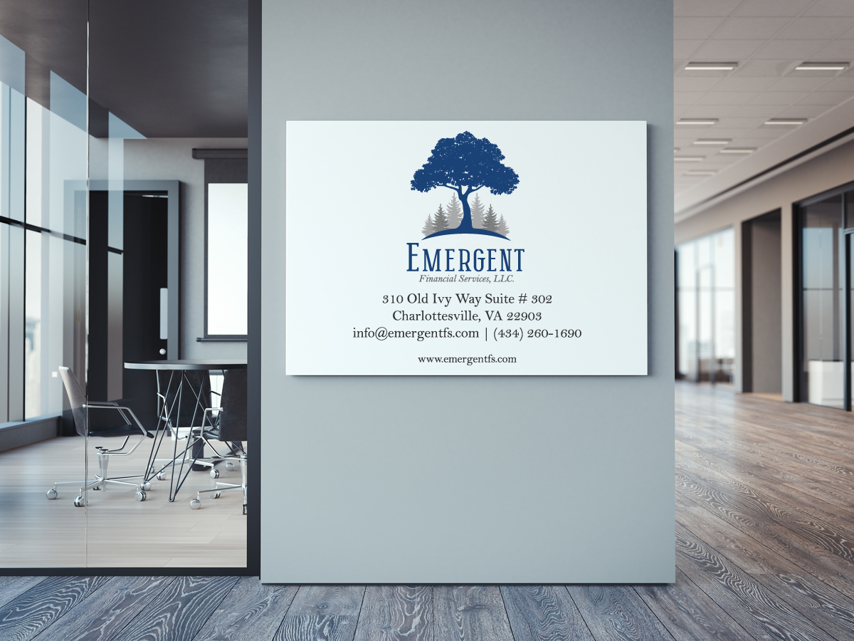
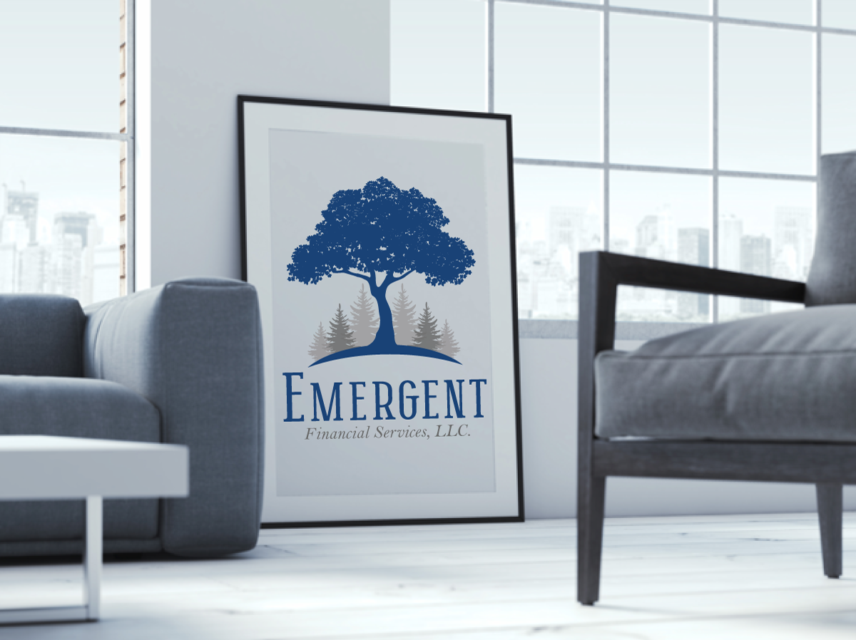
Emergent Financial Services, a family-owned firm dedicated to providing customized financial planning and investment management, approached MAJ Solutions with the need for a distinctive, professional logo that would set them apart from their competitors. The creative direction centered on a visual metaphor of trees emerging from a forest—symbolizing the company’s ability to rise above the competition and help clients achieve financial growth and stability.
Design Process
- Discovery & Concept Development: Conducted multiple meetings with the client to understand their vision, mission, and target audience. Established the core design concept of trees emerging from a forest to represent leadership, stability, and growth.
- Logo Creation: Produced three unique logo concepts that integrated the forest imagery with clean, modern typography suited for a financial brand.
- Revision Rounds: Delivered three rounds of revisions, with the client approving the second-round concept. The final phase focused on fine-tuning visual details and selecting a color palette that conveyed trust, professionalism, and sophistication.
- Brand Guidelines: Developed a comprehensive brand guideline document detailing proper logo usage, brand colors, and typefaces to ensure consistent application across all mediums.
Design Aesthetic & Rationales
- Symbolism: Trees rising above a forest convey growth, vision, and the ability to stand out—qualities central to the client’s value proposition.
- Typography: Professional, clean fonts were chosen to reinforce credibility and approachability.
- Color Palette: Balanced greens and neutral tones to represent both financial prosperity and the natural growth metaphor.
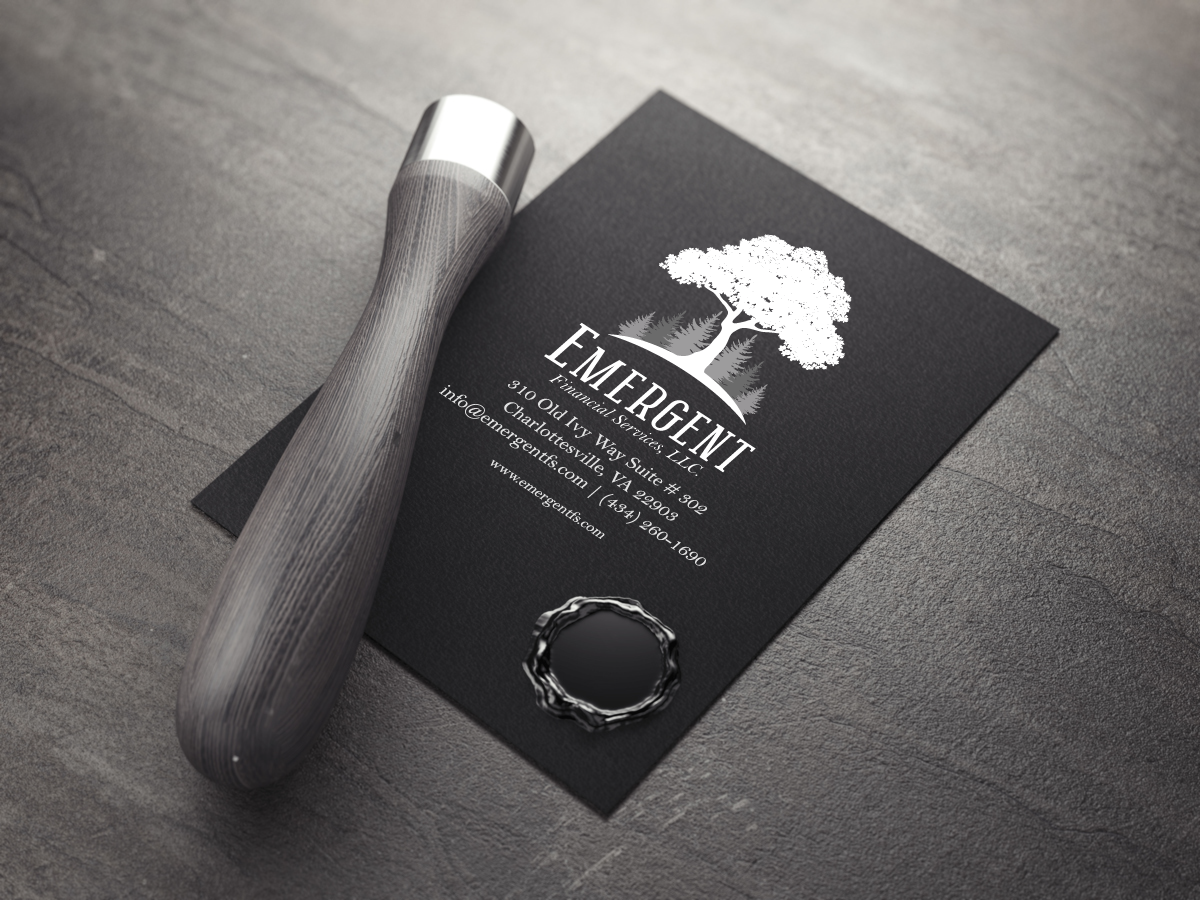
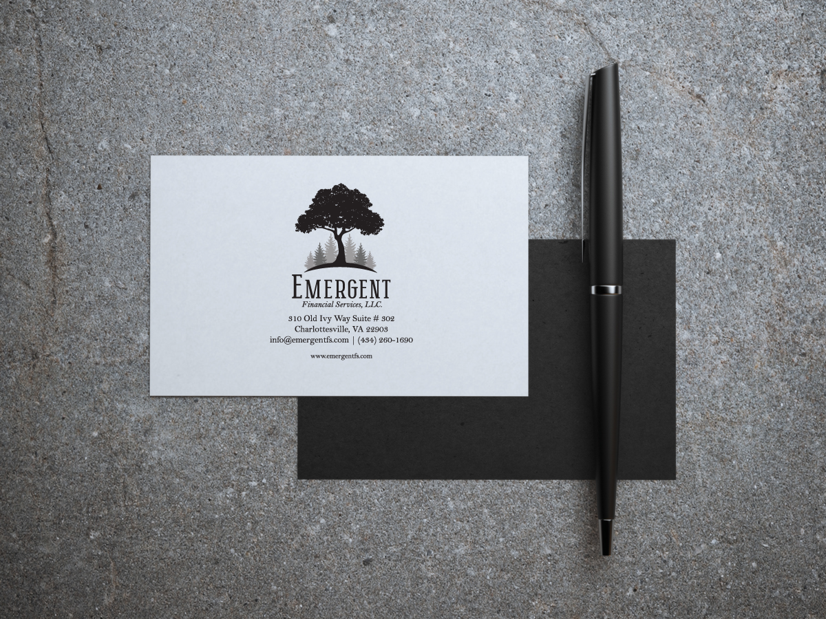
- Versatility: The logo was designed to work seamlessly in full color, grayscale, and single-color formats, ensuring adaptability across print, digital, and promotional materials.
Outcome
The final logo and brand guidelines equipped Emergent Financial Services with a polished, cohesive identity that communicates both their industry expertise and their commitment to helping clients thrive. By combining thoughtful symbolism with a clean, professional aesthetic, the brand now has a strong foundation for all future marketing and communications.
Outcome & Impact
- Voltaire Group gained a professional brand identity that elevates its public perception and builds client trust.
- Despite budget constraints, MAJ Solutions delivered a complete suite of branded materials, equipping the business with everything needed for day-to-day operations and on-site marketing.
- The branded signage helped increase local visibility, while invoices and stationery reinforced credibility in client communications.
- By focusing on strategic prioritization, MAJ Solutions ensured no compromises in design quality, proving that even small businesses on limited budgets can benefit from thoughtful branding.
Conclusion
This project is a clear example of design impact under constraint. MAJ Solutions delivered high-value results by focusing on smart design decisions, clear visual communication, and maximum utility. Voltaire Group is now equipped with a full visual identity and supporting materials that represent the professionalism and integrity behind its services—laying the foundation for long-term growth and customer confidence.