

Project Overview
F & S Services, Inc. is a tax preparation and accounting firm based in Wheaton, Maryland, specializing in personal and small business accounting, bookkeeping, payroll, and tax services. The company had an existing logo they were proud of but lacked high-quality source files, making it difficult to update or adapt their branding for modern applications.
Through LEDC’s business support program, I was commissioned to modernize the existing logo, enhance the brand identity, and develop a cohesive suite of marketing and business collateral to better represent the company’s professionalism and services.
Challenges
- Logo Limitations: The client wanted to retain the original logo’s essence but refresh and modernize it for a cleaner, more versatile look.
- Consistency Across Materials: F & S Services needed a complete brand system applied consistently to business cards, invoices, marketing folders, letterheads, and envelopes.
- Maintaining Brand Recognition: Since the business had an established client base, it was essential to update the logo without alienating existing customers.
- Limited Budget: The project required maximizing LEDC’s allocated resources while still delivering premium-quality results.
Design Approach
Logo Modernization
Instead of recreating the brand from scratch, I refined the existing logo, maintaining its recognizable structure while giving it a more polished, professional aesthetic:
- Sharpened typography for better readability and scalability.
- Refined the “F & S” monogram to make it visually balanced and modern.
- Preserved the core color palette to maintain brand recognition.
Color Palette
I retained the client’s existing colors but optimized them for print and digital consistency. The bold combination of deep navy and fresh green conveys trust, credibility, and growth — aligning with the company’s mission to support financial success.
Marketing Collateral & Print Design
I designed a complete set of marketing materials to unify the company’s visual identity across all customer touchpoints:
-
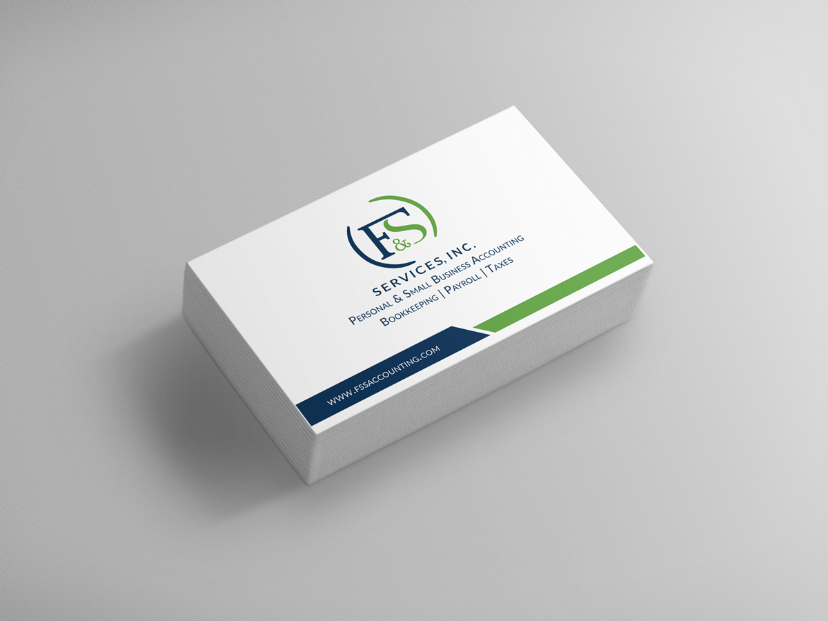
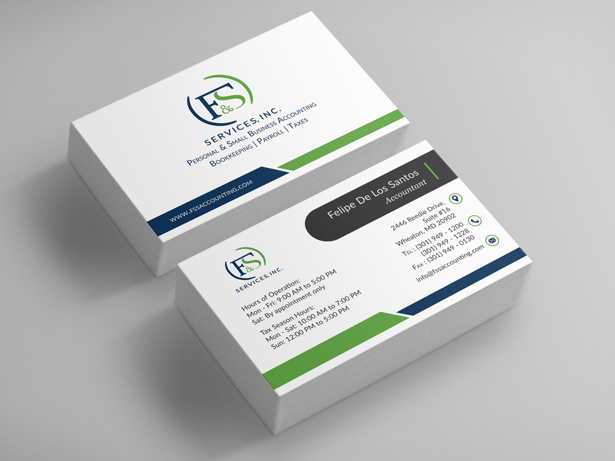
- Business Cards: Clean, modern layouts highlighting key contact details.
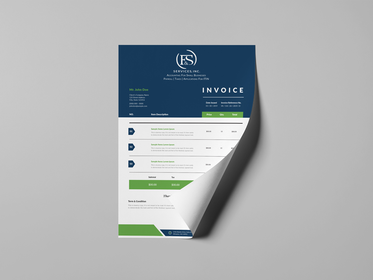
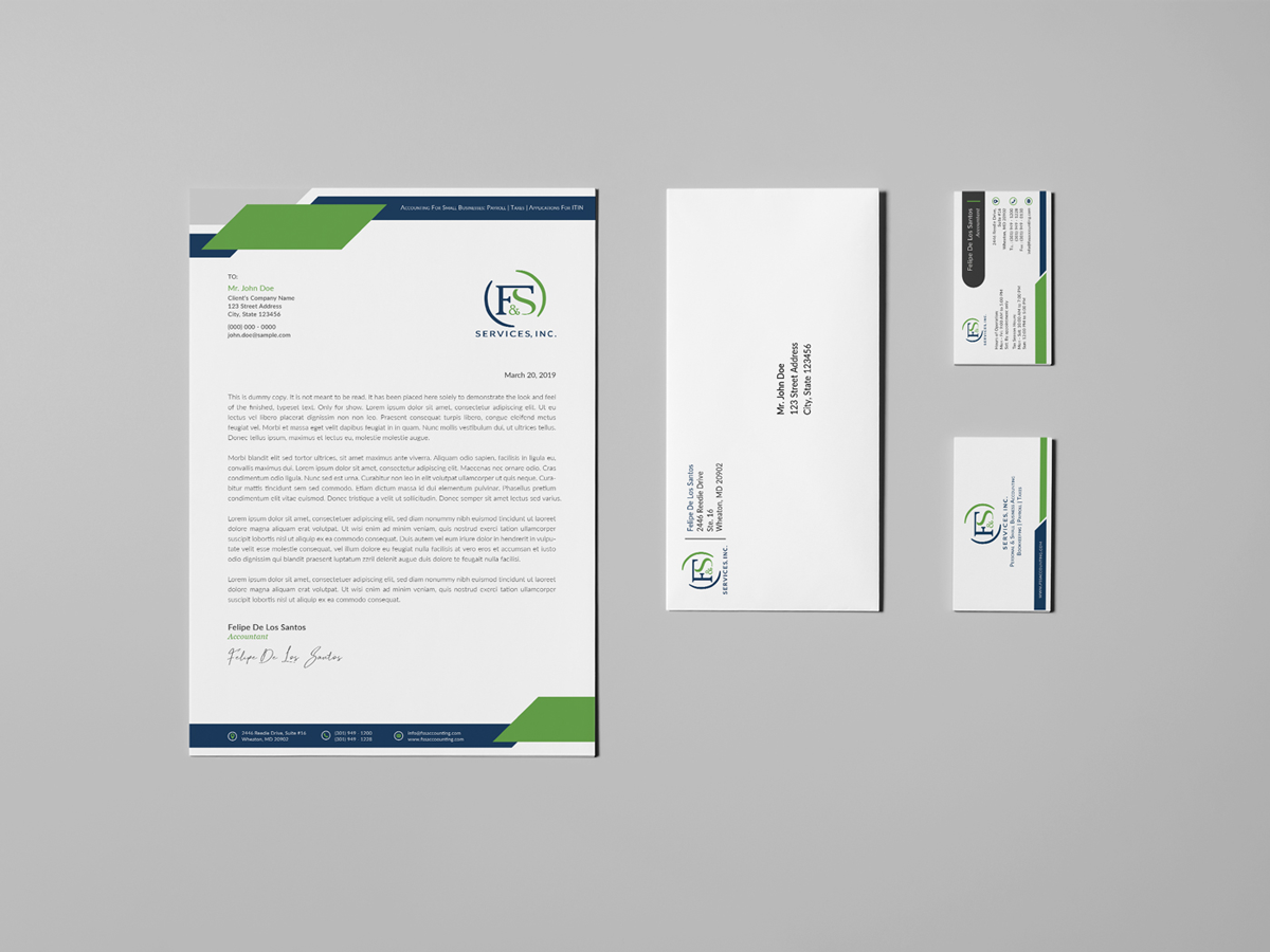
- Invoices & Letterheads: Professional templates designed for clarity and usability.
- Marketing Folders: Branded presentation folders to showcase services and enhance client onboarding.
- Mailing Envelopes: Designed for consistency and polished brand presentation.
Each piece was designed with consistency, hierarchy, and readability in mind, ensuring the brand looks professional and cohesive at every interaction.
Outcome & Impact
- Delivered a modernized logo that retained brand familiarity while improving visual appeal and versatility.
- Created a full suite of professional marketing and operational materials, elevating the company’s credibility with clients.
- Established a cohesive, high-quality visual identity that works seamlessly across print and digital formats.
- Helped F & S Services strengthen its market presence and communicate trust and professionalism to both existing and potential customers.
Conclusion
The F & S Services, Inc. project demonstrates how a thoughtful refresh can modernize a brand without losing its heritage. By refining the existing logo, optimizing the color palette, and delivering a complete marketing and print system, the company now has a strong, consistent identity that better reflects its values, services, and professionalism.


