Background
Peter Schwartz is a life coach, hypnotherapist, and master trainer who founded My Highest Potential—a company providing coaching and training services for emotional resourcing, behavioral change, and high performance. His services are utilized by corporations, mental health facilities, and professional athletes, all seeking powerful and immediate transformation.
Peter’s background in business consulting, leadership, coaching, and mental health uniquely positions him to help individuals and groups achieve measurable growth.
Phase 1: Personal Branding
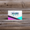
When Peter first reached out, his immediate need was a personal business card that would represent him as a professional life coach and hypnotherapist.
Design Approach:
- Minimalist Aesthetic: Clean typography with strong contrasts for a modern, professional look.
- Focus on Information: His name, contact details, and role were clearly prioritized to ensure legibility.
- Dual-Sided Design: A white front side with bold contact information and a black back side with a simple tagline, reinforcing his credibility and sophistication.
Outcome:
Peter was extremely pleased with the design, noting that it provided a professional yet approachable first impression when networking with clients and organizations.
Phase 2: Company Branding
After the success of the business cards, Peter returned to commission a company logo and broader brand identity for My Highest Potential. He wanted the visual identity to capture the essence of his work in hypnosis, mindset transformation, and personal growth.
Design Goals:
- Incorporate cerebral and mind-related elements to reflect his focus on hypnosis and mindset change.
- Ensure the logo conveys growth, clarity, and transformation.
- Create a versatile system that works across digital, print, and promotional platforms.
Art Direction & Execution:
- Primary Logo: A mark inspired by cerebral imagery, balancing abstract design with clarity and professionalism.
- Typography: Selected Arkibal—a modern typeface with clean lines and strong legibility (as detailed in the style board).
- Logo Variations: Created compact and alternate logos for flexible use, including digital icons and favicons.
Color Palette:
- Accent 1 (Deep Blue): HEX #0033b7 – symbolizes clarity, trust, and depth.
- Accent 2 (Light Blue): HEX #006db7 – represents growth, transformation, and energy.
- Secondary (Charcoal): HEX #1a1a1a – provides a professional, grounded base.
- Accent (Black): HEX #080909 – adds contrast and strength.
- Gradient: Used sparingly for digital effects to add vibrancy and depth.
Outcome & Impact
- Peter transitioned from having no formal brand identity to a polished, versatile system that elevates the credibility of My Highest Potential.
- The branding has been applied across business cards, presentations, marketing collateral, and online platforms, ensuring consistency at every client touchpoint.
- The logo’s cerebral concept resonates strongly with Peter’s work in hypnosis and mindset transformation, making it both symbolic and practical.
- Peter’s decision to return for a second commission underscores the value and trust built in the design partnership.
Outcome & Impact
- Voltaire Group gained a professional brand identity that elevates its public perception and builds client trust.
- Despite budget constraints, MAJ Solutions delivered a complete suite of branded materials, equipping the business with everything needed for day-to-day operations and on-site marketing.
- The branded signage helped increase local visibility, while invoices and stationery reinforced credibility in client communications.
- By focusing on strategic prioritization, MAJ Solutions ensured no compromises in design quality, proving that even small businesses on limited budgets can benefit from thoughtful branding.
Conclusion
This project demonstrates how design can grow alongside a client’s evolving business needs. Starting with a simple business card, the engagement expanded into a full-fledged brand identity that now serves as the cornerstone of My Highest Potential.
By integrating cerebral symbolism, modern typography, and a strong color system, the brand communicates professionalism, transformation, and trust—perfectly aligning with Peter Schwartz’s mission to help people unlock their highest potential.