Client Overview
Metro Travel is a small, women-owned travel agency based in Silver Spring, MD, serving the local Hispanic community. The agency specializes in vacation packages, flight bookings, and travel planning but lacked a cohesive visual identity and had no online presence.
Through the Latino Economic Development Center (LEDC), I was commissioned to rebrand Metro Travel and create a modern, fully functional website to help them compete in the local travel market.
This project also gave me the unique opportunity to work directly in Spanish with owner Maribel Menjivar, as she spoke little English. The collaboration pushed me to enhance my communication skills while delivering a polished, high-quality solution.


Challenges
- No cohesive branding: The previous logo and marketing materials lacked consistency and didn’t represent the business well.
- Limited budget: As an LEDC-funded project, every dollar had to be maximized to deliver maximum value.
- Lack of online presence: The client had no website and needed booking and scheduling capabilities to modernize their operations.
- Language barrier: Required adapting my process to effectively collaborate in Spanish.
Design Approach
Logo Design & Branding
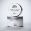
Metro Travel’s new logo was designed to represent global exploration, accessibility, and trustworthiness:
- World Map Icon: A pixel-inspired map to symbolize worldwide travel and limitless destinations.
- Playful Yet Professional Typography: A dynamic, handwritten-style font paired with clean supporting text to keep the design approachable but still credible.
- Airplane Motif: Integrated into the typography to represent flight, adventure, and movement.
Color Palette:
This palette was intentionally bold and eye-catching to resonate with Metro Travel’s Latino audience and stand out among local competitors.
- Vibrant Aqua (#3EF2E3) – Freshness, modernity, and global openness.
- Magenta Pink (#E548F5) – Energy, excitement, and creativity.
- Deep Plum (#4B1D3B) – Professionalism and contrast for balance.
- Cool Gray (#F4F6F9) – Neutral backdrop that keeps the overall design clean.


Business Cards
The business cards were designed to complement the logo while staying clean, modern, and bilingual-friendly:
- Bright color accents make them instantly recognizable.
- Designed both front and back layouts for a complete visual identity.
- Integrated social media icons, website info, and Google Maps-ready address placement for easy client access.
WordPress Website
I built a custom, responsive WordPress site to give Metro Travel an online platform that matched their new branding.
Key Features:
- Booking & Scheduling System: Allows clients to book flights, hotels, and vacation packages online.
- User-Friendly Interface: Clean layouts, intuitive navigation, and a bilingual-friendly structure.
- Optimized for Mobile: Designed with responsive layouts to provide seamless browsing across devices.
- Scalable Design: Built on a flexible foundation so the agency can easily expand offerings over time.


Outcome & Impact
- Metro Travel went from having no cohesive identity to a professional, modern brand.
- The new website enabled them to compete effectively, offering online booking and improving customer experience.
- Business cards and digital branding boosted visibility across local events, social media, and referrals.
- Delivered high-quality results on a limited LEDC budget, maximizing value without sacrificing quality.
Conclusion
This project highlights the importance of designing with purpose—not just making something look attractive, but ensuring every element works cohesively to elevate the client’s business.
For Metro Travel, the combination of a fresh visual identity, professional collateral, and a fully functional website gave the company the tools it needed to grow and compete in a modern, digital-first market—all while staying on budget and within a tight turnaround time.