Client Overview
Tiny Tots Day Care Services, LLC, established by Sharon Jones in 2013, is a childcare center rooted in a deep passion for early childhood education and development. Located in a modest single-family home in Columbus, Ohio, the center offered a nurturing environment and holistic educational approach but lacked a recognizable identity. Without a logo, signage, or cohesive branding, it struggled to establish credibility and communicate its presence to families in the community.
Tiny Tots approached MAJ Solutions with a clear challenge: to craft a bold, memorable corporate identity that would legitimize the daycare’s public image, reflect its values, and position it for long-term growth.
Challenges
- Zero Brand Infrastructure: The daycare had no existing logo or visual system in place.
- Lack of Strategic Design: Marketing materials were improvised, inconsistent, and lacked purpose.
- Low Visibility: Without professional signage or digital presence, the center blended into its residential surroundings, limiting outreach and enrollment.
Goals
- Develop a strong and cohesive visual identity that reflects the daycare’s warmth, creativity, and educational mission.
- Design an iconic logo that communicates childhood development and individuality.
- Create a system of professional marketing collateral that aligns with the new brand and improves public trust.
- Design and launch a user-friendly website that clearly communicates the center’s philosophy, services, and contact information.

Design Approach
MAJ Solutions began by crafting a strategic branding foundation, informed by the center’s mission: to foster a lifelong love of learning through safe, creative, and developmentally enriching experiences.
Logo Design:
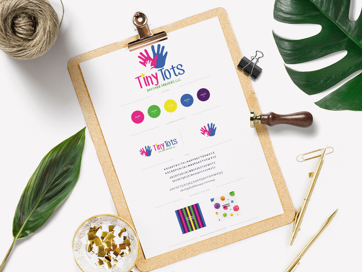
The logo features two colorful, overlapping handprints—representing guidance, individuality, and human connection. It’s supported by a bold, playful wordmark that signals joy and approachability.
Visual Identity:
Inspired by the uniqueness of children, watercolor droplets were introduced across brand materials. Each droplet symbolizes creativity and individuality—no two are the same. A vibrant, multi-color palette evokes joy and growth, while carefully chosen typography strikes a balance between playfulness and professionalism.
Marketing Collateral:
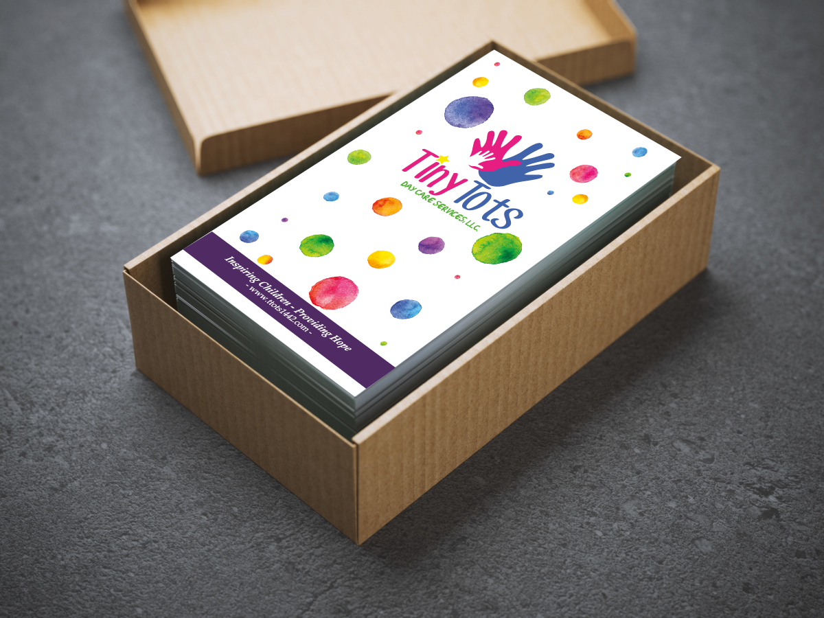
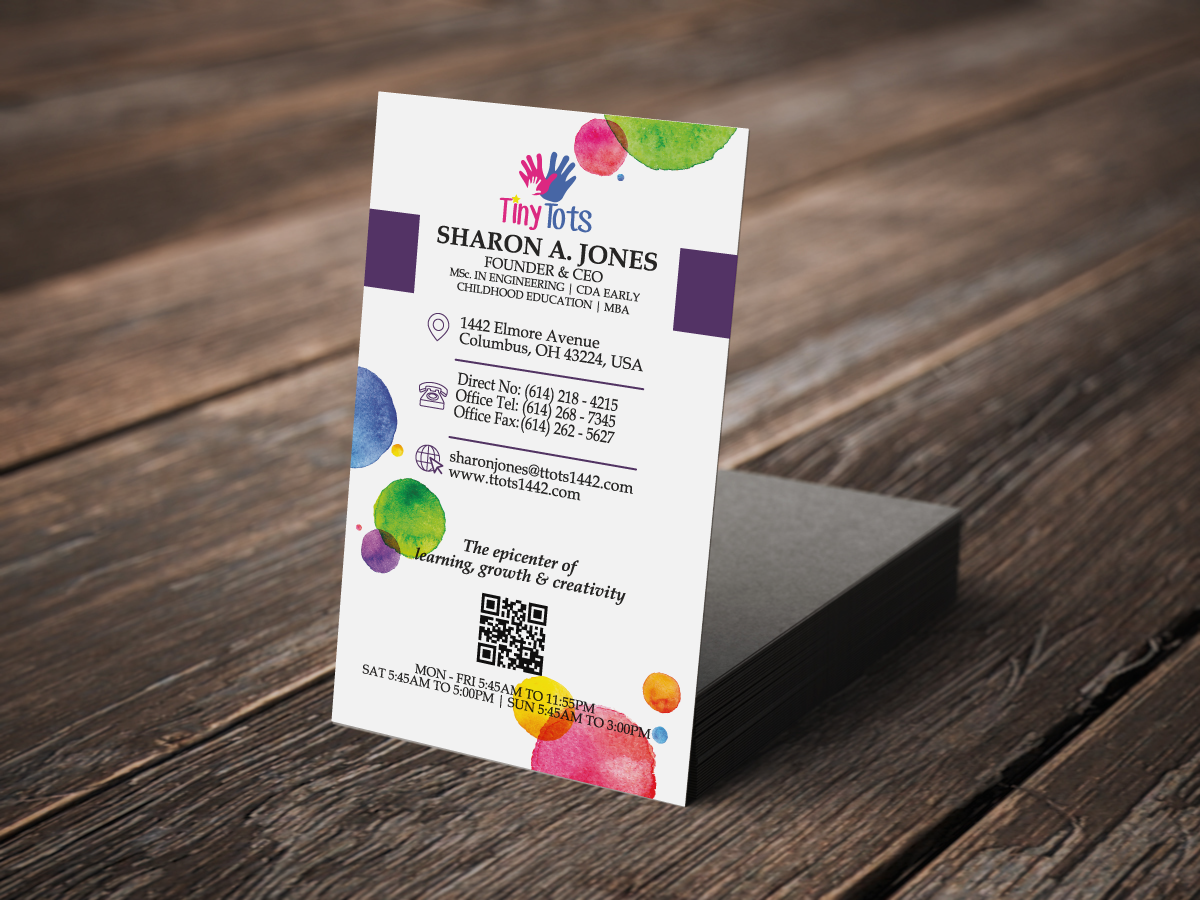
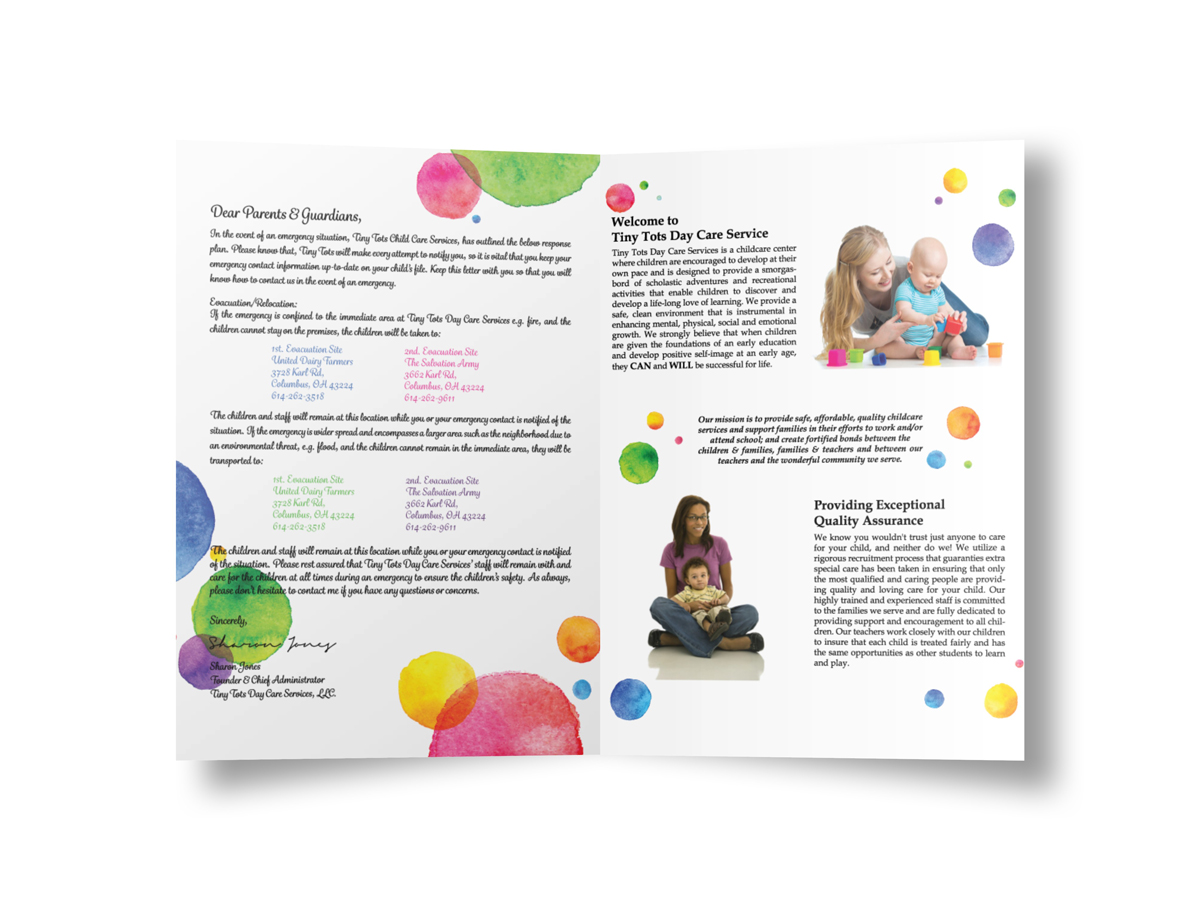
Business cards, a parent handbook, branded documents, and signage were created with consistent styling, color schemes, and messaging to ensure brand cohesion across every touchpoint.
Website Design:
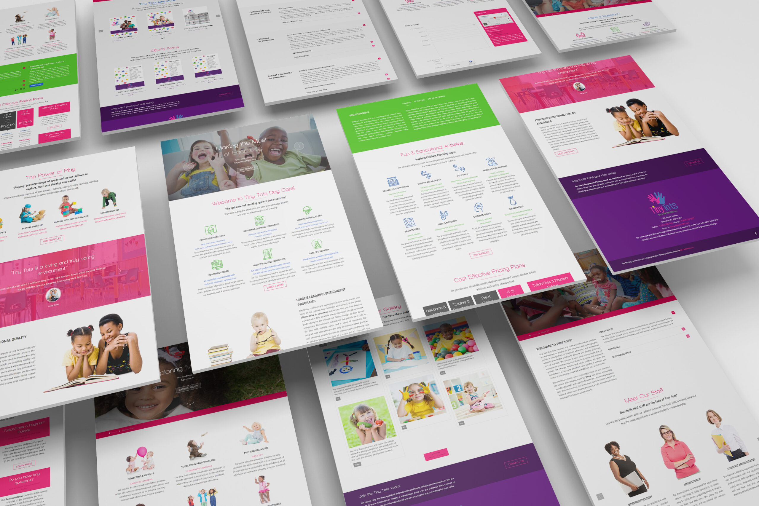
The website was designed to be clean, engaging, and informative. It emphasizes the daycare’s philosophy and features clear calls-to-action for enrollment, parent inquiries, and contact. The tone throughout the site reflects warmth, expertise, and care.


Results
- Tiny Tots transitioned from an invisible operation to a polished, professional brand that stands out in the local childcare market.
- The branding instilled confidence and trust in parents seeking a safe, high-quality daycare experience.
- The daycare’s enhanced visibility and identity enabled it to grow its enrollment base and strengthen its community presence.
- The visual system and messaging created by MAJ Solutions continues to serve as the foundation for all internal and external communication.
Conclusion
This project highlights MAJ Solutions’ ability to take a grassroots organization with no prior branding and develop a comprehensive, emotionally resonant identity. From concept to launch, the work done for Tiny Tots Day Care Services demonstrates the power of strategic design in helping small businesses gain legitimacy, connect with their audience, and thrive.


