Background
OcularIT Solutions is a family-run consulting firm delivering AI-powered software and technical solutions that help organizations leverage data and machine-learning for measurable business value. They needed a brand and digital presence that communicated clarity, precision, and trust—while staying current as the firm’s services matured.
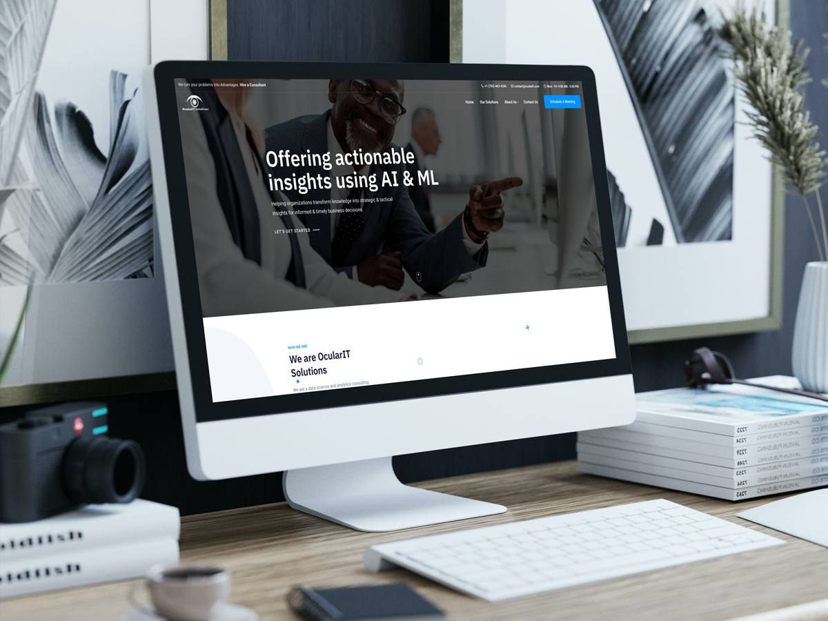
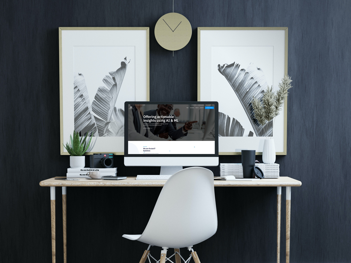
I’ve partnered with OcularIT for years as their go-to designer. They’ve returned to me for multiple projects and four complete website rebuilds, each aligning the brand and UX with evolving offerings and best practices.
Challenges
- Zero-to-one branding need: No existing mark or system that captured their “seeing insights clearly” promise.
- Complex services: Advanced topics (ML, analytics, platforms) required plain-language framing and visual clarity.
- Market parity: Compete with larger, better-funded firms through polish, credibility, and UX.
- Longevity: Build assets and a CMS that could scale and be refreshed without technical debt.
Objectives
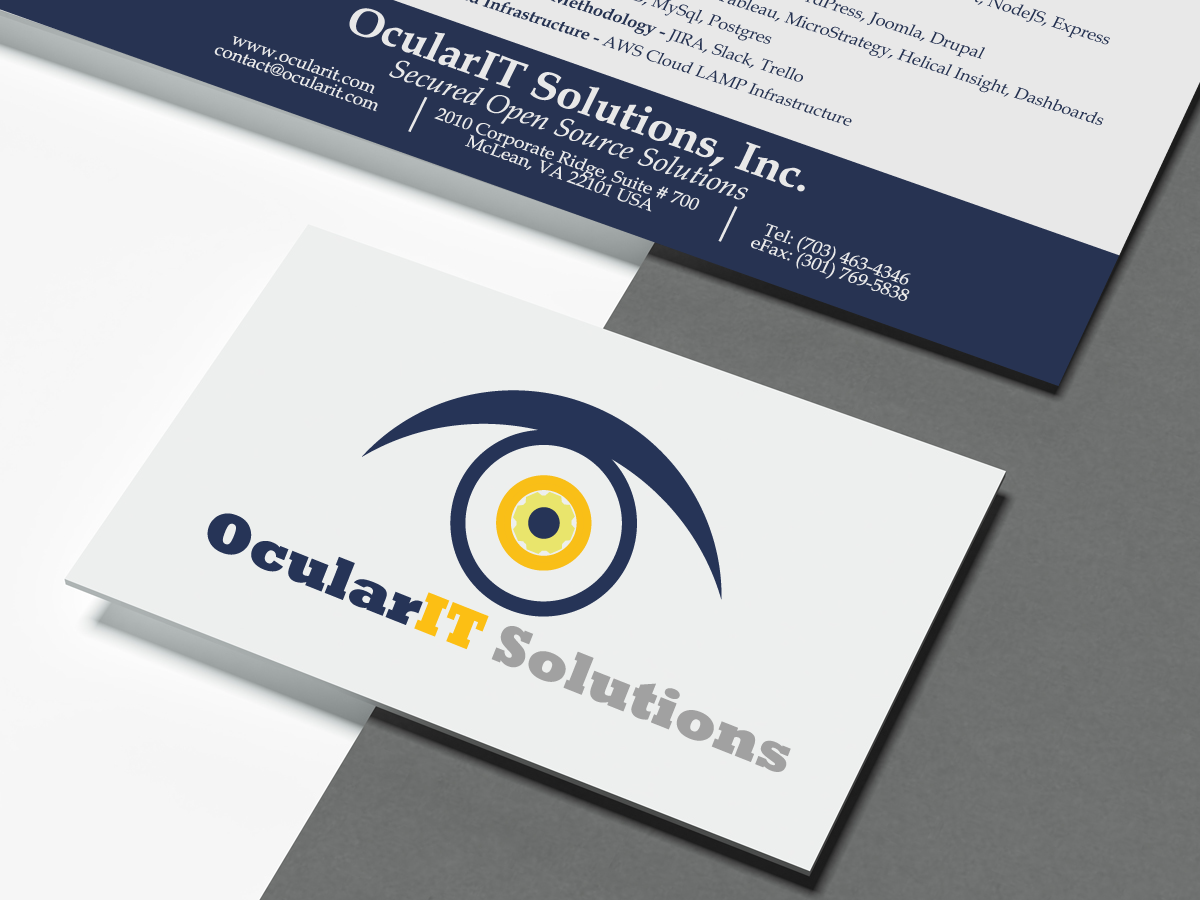
- Create a distinctive logo and visual language that signal vision, intelligence, and reliability.
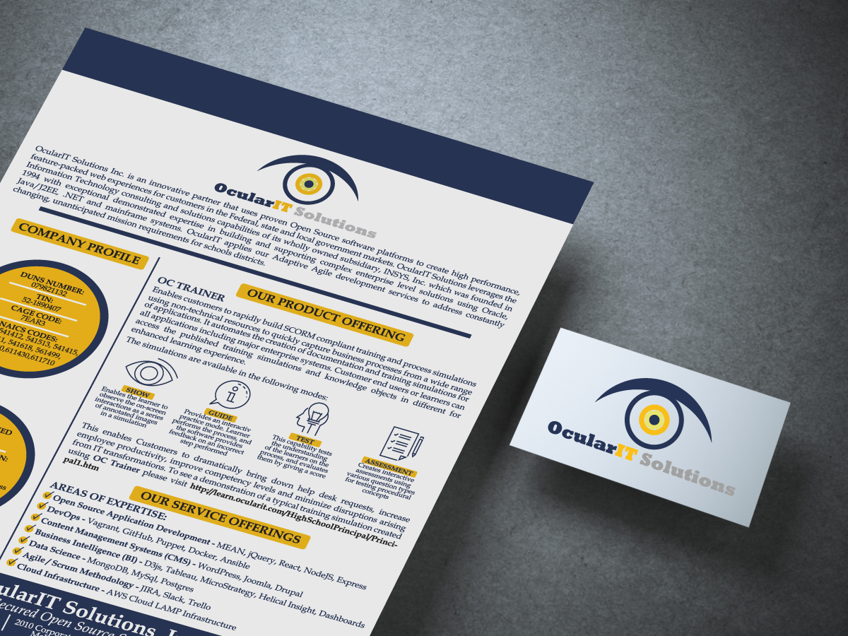
- Produce conference-ready one-pagers that explain complex services at a glance and drive follow-ups.
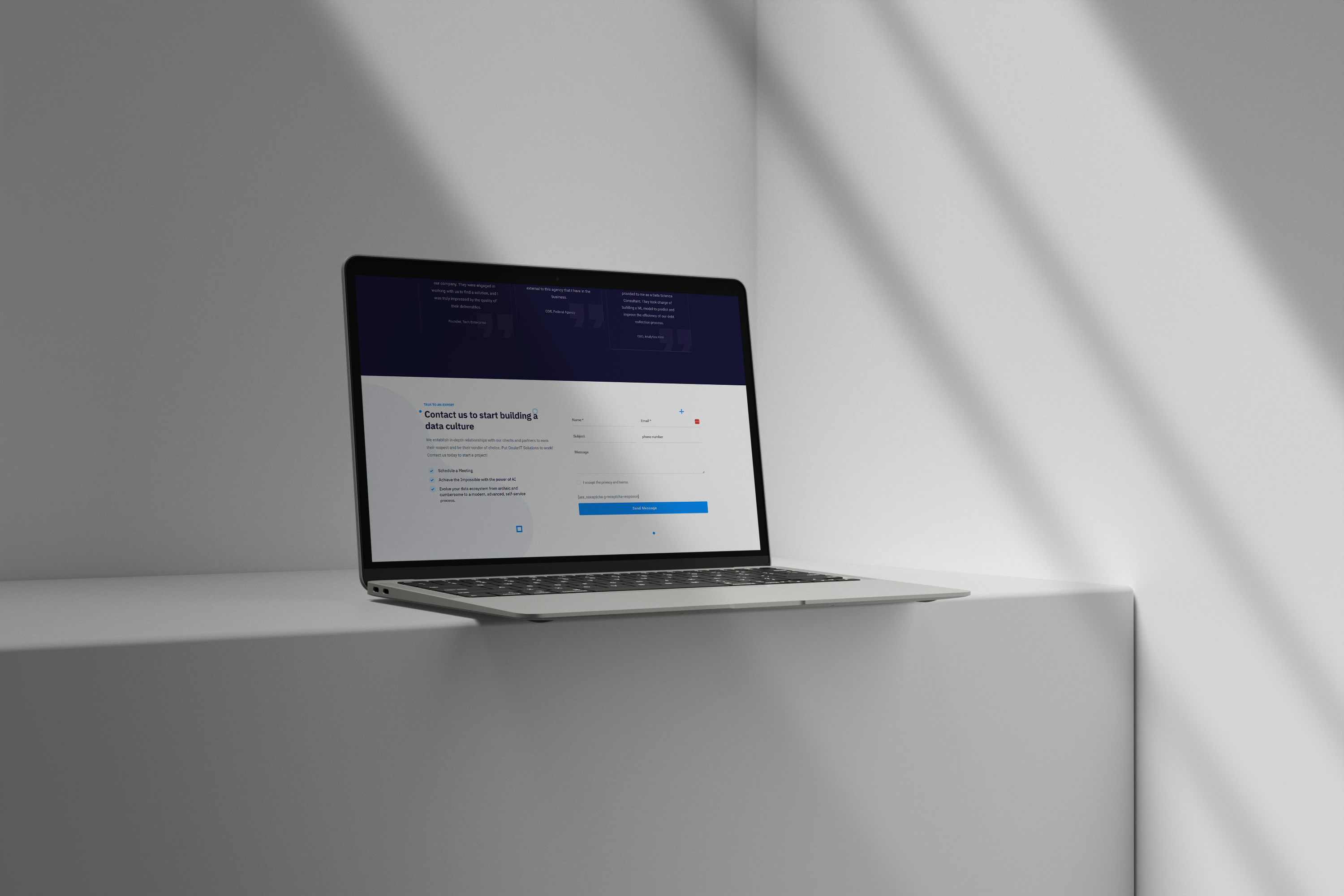
- Launch a fast, responsive WordPress site that educates, builds trust, and converts inquiries—then iteratively improve it to keep pace with design trends and the firm’s offerings.
Brand Strategy
Positioning: “Turning data into clear decisions.”
Attributes: Clear • Precise • Trustworthy • Forward-looking • Human
Visual Direction (Logo & System):
- Concept: An “ocular” motif (lens/iris) paired with geometric forms implying data points and flow—clarity + intelligence.
- Typography: Modern sans serif for precision and readability; a supporting monospace or technical accent for engineering credibility.
- Palette: Deep neutrals for stability, with a focused accent (e.g., electric blue/green) to connote insight, signal, and growth.
- Graphic Language: Clean grids, subtle line systems, and data-inspired iconography; ample white space to reduce cognitive load.
Outcome: A mark and system that feel technical but approachable, easily extended to web, slideware, PDFs, and large-format print.
Print Collateral — Conference One-Pagers
Goal: Equip sales and principals with concise collateral that survives the 10-second skim.
Structure I delivered:
- Headline value prop (problem → outcome).
- Service pillars with one-line benefits (no jargon walls).
- Mini process diagram (Discover → Model → Deploy → Measure).
- Selective proof points (industries, toolchain, certifications—client-approved content).
- Clear CTAs (site/contact).
Design system: Consistent margins, typographic hierarchy, accent color for callouts, and brand iconography. Exported press-ready and lightweight screen PDFs.
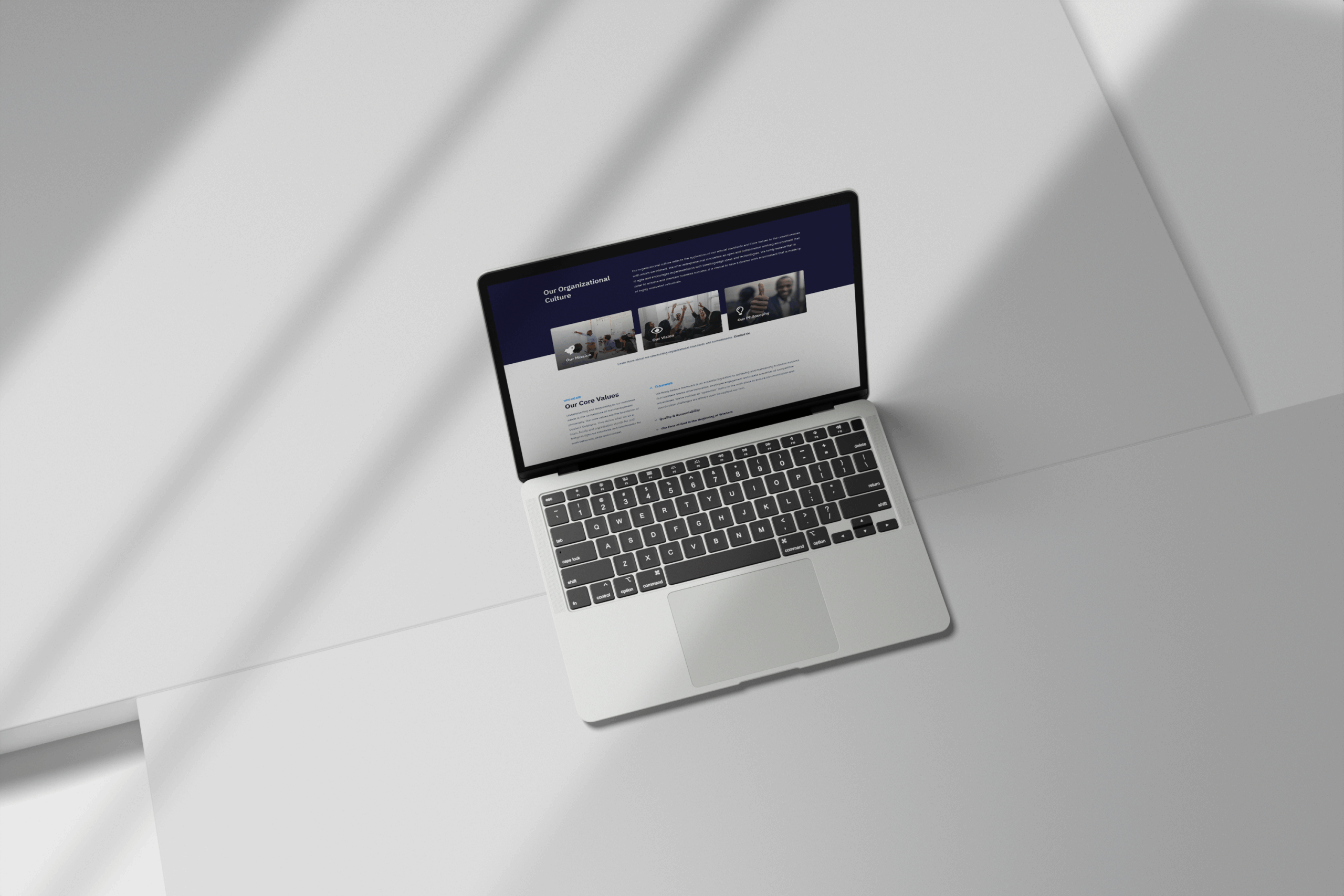
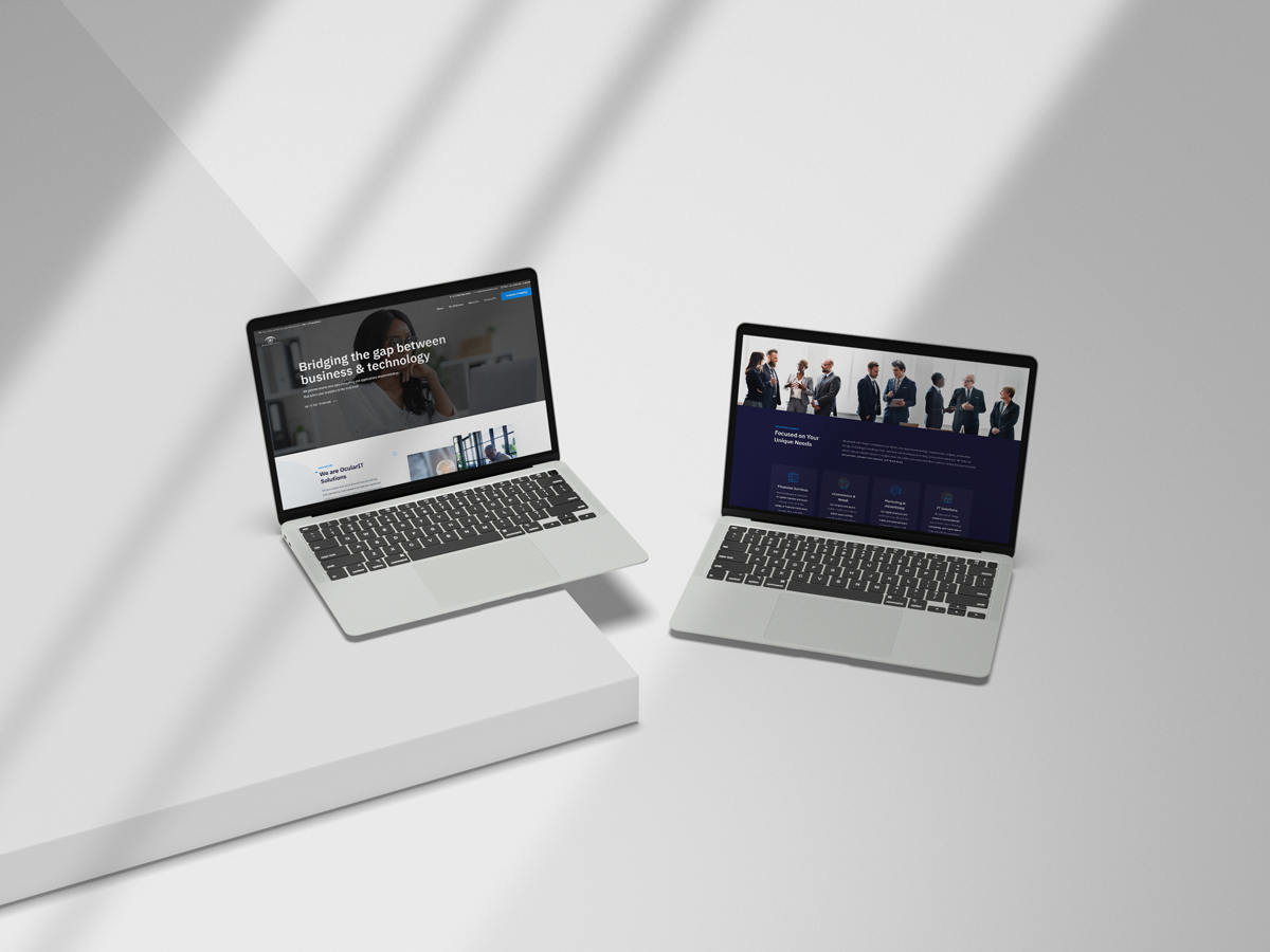
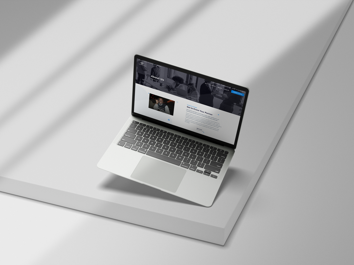
Website — Four Ground-Up Redesigns
Each rebuild kept the brand fresh and aligned to modern UX:
V1 — Establish (Launch):
- Clear IA (Services, Industries, About, Insights, Contact).
- Foundational SEO, analytics, and clean Gutenberg-based components for easy updates.
- Simple, fast, fully responsive.
V2 — Educate (Thought Leadership):
- Added Insights/Blog structure, improved taxonomy, and better internal linking.
- Rich service pages with scannable sections (overview, use cases, outcomes).
V3 — Perform (UX & Performance):
- Lean theme + selective plugins, image optimization, caching, and accessibility improvements (contrast, focus states, semantic headings).
- Micro-interactions to aid comprehension without bloat.
V4 — Convert (Messaging & Conversion):
- Tighter messaging hierarchy focused on outcomes.
- Clear CTAs across pages (consultation, contact forms).
- Modular landing-page templates for campaigns and conferences.
Common to all versions:
- Fully responsive layouts tested across breakpoints.
- Readable content design for complex topics.
- Maintainability: Pattern library / reusable blocks so the team can publish quickly without design drift.
Process
- Discovery: Audience, buying triggers, service taxonomy, competitive scan.
- Concept & Rounds: Presented logo + system, then three revision rounds (usually approved by round two; final time reserved for polish and color tuning).
- Build: Component-based WordPress with performance and accessibility in mind.
- Handoff & Governance: Brand kit, logo assets, usage notes; editor training for smooth updates.
- Iterate: Periodic refreshes to stay current with design trends and the firm’s evolving offer.
Impact (Qualitative)
- A credible, cohesive brand that consistently communicates clarity and expertise.
- Sales enablement: One-pagers and landing pages make complex offers legible and easier to act on.
- Operational efficiency: Reusable web components reduce production time for new pages and campaigns.
- Client trust: OcularIT’s continued engagement and four rebuilds over the years signal measurable satisfaction and real business value.
Conclusion
My long-term collaboration with OcularIT Solutions highlights the value of strategic, ongoing design partnerships. From the very first logo concept to the fourth complete website redesign, I’ve worked closely with the client to ensure their brand and digital presence continue to evolve alongside both industry standards and their business growth.
This project demonstrates my ability to:
- Build brands from the ground up with scalable design systems.
- Translate highly technical subject matter into clear, visually engaging experiences.
- Maintain responsiveness to client feedback while pushing design forward.
- Deliver multi-year consistency, ensuring every touchpoint—from one-pagers to websites—reinforces trust, professionalism, and clarity.
OcularIT’s decision to return to me for updates and redesigns over the years underscores the strength of the relationship, the quality of my design execution, and the real business value generated by thoughtful, evolving creative work. This case study illustrates not just a project, but an enduring partnership built on trust, adaptability, and results.
→ Visit Website
